Color, Mapping
Introduction
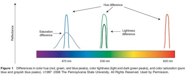
The word color is often associated with sensations that are named, such as red, blue, purple, and brown. However, the phenomenon of color is actually multidimensional. Color can be differentiated along three different dimensions: hue, lightness, and saturation. Color hue is related to the wavelengths of light that are perceived by the map reader, and is typically described using names (e.g., 'the sky is blue' or 'the rose is red'). Color lightness is the perceived lightness or darkness of color, and is related to the quantity of light at a given wavelength. If an object reflects or emits a larger amount of light, it will be perceived as having a lighter color than an object that reflects or emits a smaller amount of light. Color saturation is a measure of color purity. Highly saturated colors are the purest, like lemon yellow or ruby red, while less saturated colors are muddy and grayish, like olive green. Highly saturated colors are created from narrow wavelengths of light, while less saturated colors contain light at a wider range of wavelengths (Figure 1).
Color Vision and Perception
Color vision, like all human vision, is the product of the human eye–brain system interpreting electromagnetic radiation. In other words, as a phenomenon, color does not exist independently of the image that the human brain creates.
The human eye–brain system is composed of three
components:
- a source of visible light – the portion of the electromagnetic spectrum between the wavelengths of 370 and 770 nm (blue light and red light, respectively);
- the eye, whose lens focuses light that enters through the retina on a collection of specialized light sensitive cells, and whose optic nerve relays signals generated by these cells to the brain and;
- the brain, which constructs the sensation of color from the optic nerve signals after they reach the visual cortex at the rear of the brain.
Within the eye, there are two major types of light sensitive cells: rods and cones. Rod cells are sensitive to the intensity of light rather than its wavelength, and therefore do not play a large role in color vision. Cone cells, on the other hand, are sensitive to different areas of the visible portion of the electromagnetic spectrum. Human eyes have three types of cone cells, each sensitive to different wavelengths of light (i.e., color hues): L cones (long wavelengths – red light), M cones (medium wavelengths – green light), and S cones (short wavelengths – blue light). These different types of cone cells are differentially distributed in terms of both location and sensitivity across the retina. For example, while the S cones cover the most area, they are the least sensitive to light.
There are two main theories that explain how the brain constructs color from the signals generated by the eye's cone cells. The first, termed the trichromatic theory, holds that the color that map readers see is dependent upon the combination of the relative amounts of stimulation each of the three cone types receives. In other words, blue light will stimulate the S cones more than the M cones or the L cones. The second theory is the opponent process theory, which proposes that color perception depends on two opponent color channels (red–green and blue–yellow) and a lightness–darkness channel. The opponent color channels are based on the idea that there are no colors that are mixtures of red and green or that are mixtures of blue and yellow (as compared to the mixture of red and blue, which yields purple, or of red and yellow, which yields orange). Physiologically, the red–green channel is believed to result from comparing the signals from the L and M cones, while the yellow–blue channel results from a comparison of the S cones with the sum of the signal from the L and M cones.
Simultaneous Contrast
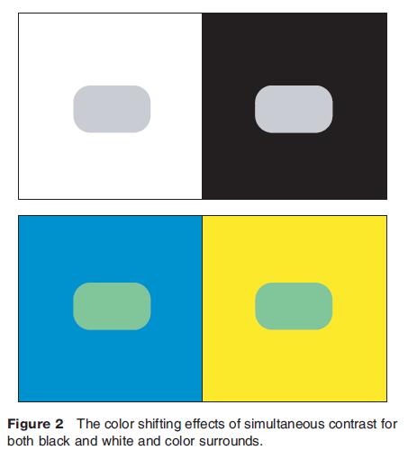
Simultaneous contrast is the phenomenon in which the eye perceives differences in color when two objects of the same color are surrounded by differently colored backgrounds. This shift of color (i.e., the apparent differences) can be discussed in terms of the opponent process theory of color perception. In the black and white context, simultaneous contrast causes a shift toward the opposite end of the black–white color channel. In other words, if an object is surrounded by a white background, it will look darker than it will when surrounded by a dark background. In the color context, simultaneous contrast will induce color shifts toward the opponent color of that color channel. For example, a yellow background will make objects it surrounds look bluer (Figure 2).
Color Vision Impairment
The physiology of the human eye can also be used to explain individual differences in how map readers perceive color. Although its prevalence varies in different parts of the world, up to 4% of the population experiences some form of color vision impairment. The condition is more common in males than in females, with up to 8% of North American and European men experiencing color vision impairment.
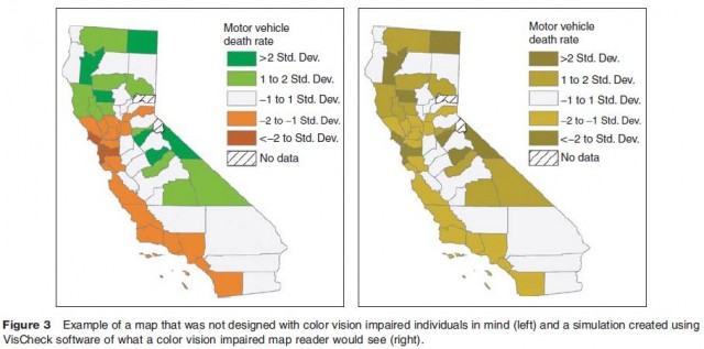
The most common type of color vision impairment results in difficulty distinguishing between reddish and greenish colors, but the condition also affects hue pairs other than red and green, such as magenta and cyan. Scientists believe that this type of color vision impairment may be related to changes in the L cones and M cones of impaired individuals. The effects of color vision impairment have been described using color confusion lines that identify color hues that may be confused by individuals with particular types of color vision impairment. Generally, hues that fall along one confusion line will be difficult for color vision impaired individuals to differentiate, while those that fall across the lines will be differentiable. Moreover, regardless of an individual's degree of color vision impairment, he or she will be able to see differences in lightness, so it is possible to design color combinations for maps that will accommodate map readers with color vision impairment (Figure 3).
Color Specification Systems
Color specification systems are scientific systems for identifying and precisely describing different colors. Color specification systems are needed because of the imprecision of the color vocabulary in everyday language. For example, the word 'blue' may cause some individuals to imagine the color of the sky on a sunny day, while others may imagine the color of blueberries or the color of blue jeans. They are also important because different methods of map production require the use of different specification systems.
Color specification systems can be divided into two major classes: user oriented and production oriented systems. User oriented systems have the advantage that they explicitly consider human perceptual capabilities. However, user oriented systems eventually must be translated into a production oriented system to make the map. Production oriented systems, as the name implies, are based on the production technology used for constructing the map. The main disadvantage of using production oriented systems is that they are specific to particular types of map production (e.g., print vs. electronic maps), and do not explicitly take color perception into account.
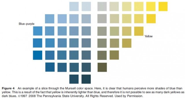
The primary user oriented color specification system is the Munsell system, which was derived from extensive user testing with color pigments. This system divides up the colors humans are capable of perceiving into equal perceptual divisions of color lightness and color saturation for each color hue. Working with this system, it quickly becomes apparent that humans do not perceive the same number of different shades of each color hue. A particular advantage of working with this system is that it is easy to create smooth transitions in color lightness or saturation when designing a color scheme (Figure 4).
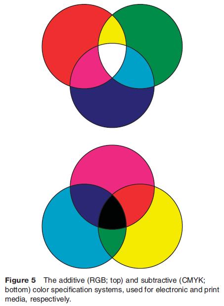
Production oriented color specification systems can be further classed according to whether the production technology generates electronic or printed maps. The human eye senses two types of light: light that is emitted from a light source (such as a computer monitor or television) and reflected light (light that was generated by the Sun or another power source and has subsequently been reflected off the surface of an object). Additive color specification systems are used for describing emitted light, while subtractive color specification systems are used for describing reflected light.
The name 'additive' is derived from the fact that additional types of cones in the eye are stimulated when different wavelengths of light are mixed (e.g., adding red light to blue light to produce purple light will stimulate both L cones and S cones). The color specification system that is used for additive color is the RGB (red, green, blue) system commonly used for computer monitors. Computer monitors produce color by emitting light from three color guns (one each of red, green, and blue light). In this system, each color gun can emit light at 256 levels of intensity, producing a range of color combinations, with 255 being the highest intensity of light and 0 being the lowest (Figure 5).
Subtractive color specification systems are used when pigments (e.g., ink or paint) are used to produce maps. Subtractive colors are determined by the wavelength of light that is left after the pigments on the paper have absorbed other wavelengths. For example, we see the color blue when the ink on a page absorbs light in the red and green portions of the electromagnetic spectrum. The two main subtractive color specification systems are cyan, magenta, yellow, and black (CMYK) and spot color. In the CMYK system, which is commonly used in inkjet printers, laser printers, and printing presses, each of the four standard pigments is applied using a screen in amounts ranging from 0% to 100%, with 0% specifying that none of the pigment is placed on the page, and 100% indicating that the full strength of the pigment is applied. Spot color is similar in that in this system the amount of pigment ranges from 0% to 100%, but different in that each spot color is a premixed pigment.
Choosing and Designing Color Schemes
There are three major types of color schemes that can be employed in thematic maps: sequential, diverging, and qualitative. Sequential color schemes use one or a small number of color hues, at a number of different lightness levels. Diverging color schemes are constructed by joining the lightest end of two different sequential schemes. The difference in color lightness between adjacent symbols in sequential and diverging color schemes should be similar so that map readers do not see a big jump between one class and the next. Qualitative color schemes are composed of symbols of similar lightness and saturation but different hues (Figure 6).

Cartographers choose the type of color scheme to be used based on characteristics of their data. The main distinction that they consider is whether their data are quantitative (showing differences in the amount of a phenomenon) or qualitative (showing differences in the kind of phenomenon). Sequential and diverging schemes are used for quantitative data. Most map readers associate light symbols with a smaller quantity and darker symbols with a larger quantity, which makes sequential and diverging schemes good choices for representing differences in amounts. In particular, cartographers choose diverging schemes when they want their map to allow map readers to make comparisons with critical values (e.g., zero population growth, mean precipitation, or the government defined poverty line). In this case, the critical value should fall in the central, light category. Qualitative schemes, on the other hand, contain hue differences rather than lightness differences. Because hues are not associated with quantities (e.g., red is not more than purple), they are effective for representing differences in kind.
Designing color schemes to accommodate individuals with color vision impairment requires additional thought. The effects of color vision impairment have been described using color confusion lines that identify color hues that may be confused by individuals with particular types of color vision impairment. Generally, hues that fall along one confusion line will be difficult for color vision impaired individuals to differentiate, while those that fall across the lines will be differentiable.