Maps and Cartography
Cartography is the field of geography concerned with making maps. A map is a paper representation of space showing point, line, or area data—that is, locations, connections, and regions. It typically displays a set of characteristics or features of the Earth's surface that are positioned on the map in much the same way that they occur on the surface. The map's scale links the true distance between places with the distance on the map.
Maps play an essential role in the study of physical geography because much of the information content of geography is stored and displayed on maps. Map literacy—the ability to read and understand what a map shows—is a basic requirement for day-to-day functioning in our society. Maps appear in almost every issue of a newspaper and in nearly every TV newscast. Most people routinely use highway maps and street maps. Maps also pop up on web sites. The purpose of this part of our chapter is to provide additional information on the art and science of maps.
MAP PROJECTIONS
Cartographers record position on the Earth's surface using latitude and longitude. You'll read more about latitude and longitude in Chapter 1, but for now, you probably know that latitude measures position in a northsouth direction and that longitude measures position in an east-west direction. Lines of equal latitude are parallels, and lines of equal longitude are meridians.
A map projection is an orderly system of lines of latitude and longitude used as a base to draw a map on a flat surface. A projection is needed because the Earth's surface is not flat but, rather, curved in a shape that is very close to the surface of a sphere. All map projections misstate the shape of the Earth in some way. It's simply impossible to transform a spherical surface to a flat (planar) surface without violating the true surface as a result of cutting, stretching, or otherwise distorting the information that lies on the sphere.
Perhaps the simplest of all map projections is a grid of perfect squares. In this simple map, horizontal lines are parallels and vertical lines are meridians. They are equally spaced in degrees, so this projection is sometimes called an equal-angle grid. A grid of this kind can show the true spacing (approximately) of the parallels, but it fails to show how the meridians converge toward the two poles. This convergence causes the grid to fail dismally in high latitudes, and the map usually has to be terminated at about 70° to 80° north and south.
Early attempts to find satisfactory map projections made use of a simple concept. Imagine the spherical Earth grid as a cage of wires located on meridians and parallels. A tiny light source is placed at the center of the cage, and the image of the wire grid is cast upon a surface outside the sphere. This situation is like a reading lamp with a lampshade. Basically, three kinds of “lampshades” can be used, as shown in Figure I.10. First is a flat paper disk perched on the north pole. The shadow of the wire grid on this plane surface will appear as a combination of concentric circles (parallels) and radial straight lines (meridians). Here we have a polar-centered, or polar projection. Second is a cone of paper resting pointup on the wire grid. The cone can be slit down the side, unrolled, and laid flat to produce a map that is some part of a full circle. This is called a conic projection.
Parallels are arcs of circles, and meridians are radiating straight lines. Third, a cylinder of paper can be wrapped around the wire sphere so as to be touching all around the equator. When slit down the side along a meridian, the cylinder can be unrolled to produce a cylindrical projection, which is a true rectangular grid.
None of these three projection methods can show the entire Earth grid, no matter how large a sheet of paper is used to receive the image. Obviously, if the entire Earth grid, or large parts of it, are to be shown, some quite different system must be devised. In Chapter 1, we describe three types of projections used throughout the book—the polar projection; the Mercator projection, which is a cylindrical projection; and the Winkel Tripel projection, which uses special mathematics that provide minimum distortion in a global map.
SCALES OF GLOBES AND MAPS
All globes and maps depict the Earth's features in much smaller size than the true features they represent. Globes are intended in principle to be perfect scale models of the Earth itself, differing from the Earth only in size. The scale of a globe is the ratio between the size of the globe and the size of the Earth, where “size” is some measure of length or distance (but not of area or volume).
Take, for example, a globe 20 cm (about 8 in.) in diameter, representing the Earth, which has a diameter of about 13,000 km. The scale of the globe is the ratio between 20 cm and 13,000 km. Dividing 13,000 by 20, we see that one centimeter on the globe represents 650 kilometers on the Earth. This relationship holds true for distances between any two points on the globe.
Scale is often stated as a simple fraction, termed the scale fraction. It can be obtained by reducing both Earth and globe distances to the same unit of measure, which in this case is centimeters. (There are 100,000 centimeters in one kilometer.) The advantage of the scale fraction is that it is entirely free of any specified units of measure, such as the foot, mile, meter, or kilometer. It is usually written as a fraction with a numerator of one using either a colon or with the numerator above the denominator. For the example shown above, the scale fraction is obtained by reducing 20/1300000000 to 1/65000000 or 1:65,000,000.
In contrast to a globe, a flat map cannot have a constant scale. In flattening the curved surface of the sphere to conform to a plane surface, all map projections stretch the Earth's surface in a nonuniform manner, so that the map scale changes from place to place. However, it is usually possible to select a meridian or parallel—the equator, for example—for which a scale fraction can be given, relating the map to the globe it represents.
SMALL-SCALE AND LARGE-SCALE MAPS
When geographers refer to small-scale and large-scale maps, they mean the value of the scale fraction. For example, a global map at a scale of 1:65,000,000 has a scale fraction value of 0.00000001534, which is obtained by dividing 1 by 65,000,000. A hiker's topographic map might have a scale of 1:25,000, for a scale value of 0.000040. Since the global-scale value is smaller, it is a small-scale map, while the hiker's map is a large-scale map. Note that this contrasts with common use of the terms large-scale and small-scale. When we refer in conversation to a large-scale phenomenon or effect, we typically refer to something that takes place over a large area and that is usually best presented on a small-scale map.
Maps of large scale show only small sections of the Earth's surface. Because they “zoom in,” they are capable of carrying an enormous amount of geographic information in a convenient and an effective manner. Most large-scale maps carry a graphic scale, which is a line marked off into units representing kilometers or miles. Figure I.11 shows a portion of a large-scale map on which sample graphic scales in miles, feet, and kilometers are superimposed. Graphic scales make it easy to measure ground distances.
For practical reasons, maps are printed on sheets of paper usually less than a meter (3 ft) wide, as in the case of the ordinary highway map or navigation chart. Bound books of maps—atlases, that is—usually have pages no larger than 30 by 40 cm (about 12 by 16 in.), whereas maps found in textbooks and scientific journals are even smaller.
CONFORMAL AND EQUAL-AREA MAPS
With regard to the map projections shown in Figure I.10, it seems obvious that the shape and area of a small feature, like an island or peninsula, will change as the feature is projected from the surface of the globe to a map. With some projections, the area will change, but the shape will be preserved. Such a projection is referred to as conformal. The Mercator projection (Figure 1.11) is an example. Here, every small twist and turn of the shoreline of each continent is shown in its proper shape. However, the growth of the continents with increasing latitude shows that the Mercator projection does not depict land areas uniformly. A projection that does show area uniformly is referred to as equal-area. Here continents show their relative areas correctly, but their shapes are distorted. No projection can be both conformal and equal-area—only a globe has that property.
INFORMATION CONTENT OF MAPS
The information conveyed by a map projection grid system is limited to one category only: absolute location of points on the Earth's surface. To be more useful, maps also carry other types of information. Figure I.11 is a portion of a large-scale multipurpose map. Map sheets published by national governments, such as this one, are usually multipurpose maps. Using a great variety of symbols, patterns, and colors, these maps carry a high information content. Appendix 3 shows a larger example of a multipurpose map, a portion of a U.S. Geological Survey topographic quadrangle map for San Rafael, California.
In contrast to the multipurpose map is the thematic map, which shows only one type of information, or theme. We use many thematic maps in this text. Some examples include Figure 4.25, mapping the frequency of severe hailstorms in the United States; Figure 5.17, atmospheric surface pressures; Figure 7.7, mean annual precipitation of the world; and Figure 7.10, world climates.
MAP SYMBOLS
Symbols on maps associate information with points, lines, and areas. To show information at a point, we use a dot—any small symbol to show point location. It might be a closed circle, an open circle, a letter, a numeral, or a graphic symbol of the object it represents. A line can vary in width and can be single or double, colored, dashed, or dotted. A patch denotes a particular area, typically using a distinctive pattern or color or a line marking its edge.
Figure I.12 shows symbols applied to a map. There are two kinds of dot symbols (both symbolic of churches), three kinds of line symbols, and three kinds of patch symbols. Altogether, eight types of information are present. Line symbols freely cross patches, and dots can appear within patches. Two different kinds of patches can overlap. For more examples of symbols, consult the display of topographic map symbols facing the map of San Rafael in Appendix 3.
Map symbols can vary with map scale. Maps of very large scale, for example, a plot plan of a house, can show objects in their true outline form. As map scale is decreased, representation becomes more and more generalized. In physical geography, an excellent example is the depiction of a river, such as the lower Mississippi, shown in Figure I.13. The level of depiction of fine detail in a map is described by the term resolution. Maps of large scale have much greater resolving power than maps of small scale.
PRESENTING NUMERICAL DATA ON THEMATIC MAPS
In physical geography, we often need to display numerical information on maps. Weather data provides an example—here we might wish to display air temperature, air pressure, wind speed, or amount of rainfall. Another category of information consists simply of the presence or absence of something. In this case, we can simply place a dot to mean “present,” so that when entries are completed, the map shows a field of scattered dots.
In some scientific programs, measurements are taken uniformly, for example, at the centers of grid squares laid over a map. For many classes of data, however, the locations of the observation points are predetermined by a fixed and nonuniform set of observing stations. For example, weather and climate data are often collected at stations typically located at airports. Whatever the sampling method used, we end up with an array of numbers and dots indicating their location on the base map.
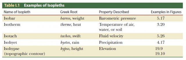
Although the numbers and locations may be accurate, it may be difficult to see the spatial pattern present in the data being displayed. For this reason, cartographers often simplify arrays of point values into isopleth maps. An isopleth is a line of equal value (from the Greek isos, “equal,” and plethos, “fullness” or “quantity”). Figure 3.21 shows how an isopleth map is constructed for temperature data. In this case, the isopleth is an isotherm, or line of constant temperature. In drawing an isopleth, the line is routed among the points in a way that best indicates a uniform value, given the observations at hand.
Isopleth maps are important in various branches of physical geography. Table I.1 gives a partial list of isopleths of various kinds used in the Earth sciences, together with their names and the kinds of information they display. A special kind of isopleth, the topographic contour (or isohypse), is shown on the maps in Figures I.11, I.13A, and in the portion of the San Rafael topographic map in Appendix 3. Topographic contours show the configuration of land surface features, such as hills, valleys, and basins.
In contrast to the isopleth map is the choropleth map, which identifies information in categories. Our global maps of vegetation and soils are examples of thematic choropleth maps. Cartography is a rich and varied field of geography with a long history of conveying geographic information accurately and efficiently. If you are interested in maps and mapmaking, you might want to investigate cartography further.