Temporal Re-Expression, Filtering, and Interpolation
Although the most obvious way to animate spatiotemporal data is to simply play the data in the same sequence as it was collected (e.g., day 1 – frame 1, day 2 – frame 2, and so on), this is not always very insightful because: (1) the data may be very complex and contain multiple meaningful patterns, and/or (2) the data may be very noisy.
Temporal re expression is one of the most powerful cartographic transformations we can apply to better understand spatiotemporal data (the term was coined by David DiBiase in the early 1990s, although early examples appeared in the 1970s). Temporal re expression is displaying the same dataset using different temporal units in which the data are aggregated to create composite frames (or moments) in the animation. For example, in Figure 2 the 360 days of drinking related incidents can be animated over a composite day (24-frame animation) to show how these might differ according to time of day allowing us to answer questions such as, 'do more incidents occur at 8 am than at 8 pm?' Because the data are mapped, the spatial patterns of accidents and where those accidents occur (and by what cause factor) can be investigated allowing the reader, for example, to ask 'even if the number of incidents are the same, does where they occur differ between 8 am and 8 pm?' The map also depicts the incident data as a composite week (e.g., 'Do more incidents occur on Mondays than on Fridays?'), and composite month (e.g., December vs May).
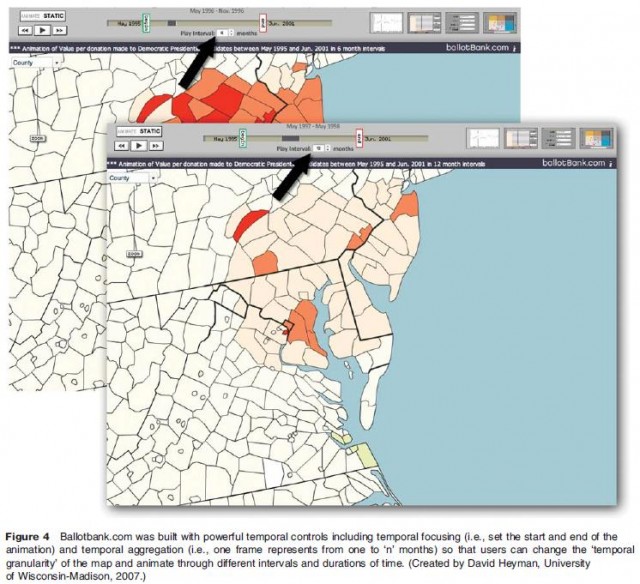
Temporal aggregation – changing the temporal granularity of the map – allows viewers to create temporal slices of different thickness. At ballotbank.com (Figure 4) financial campaign contributions are initially displayed monthly (the finest temporal unit available), although the viewer can aggregate and average the data on the fly over long intervals. In Figure 4, the temporal granularity of the map has been increased from 6 months to 12 months (each frame now shows a 12 month period). Because campaign contributions are closely tied with tax season, as well as election cycles (both 2 and 4 years), this flexibility can help to uncover subtle behaviors in political participation that the most temporally disaggregate data obscures. The website ballotbank.com also incorporates temporal focusing which lets the map reader set the start and end dates of the animation.

Many animated maps employ temporal interpolation to 'fill in' missing time periods or to create a smoother looking animation. In some published examples, the interpolated data outnumbers the 'real' data 10 to 1. Although popular, the cognitive effectiveness of temporal interpolation has only been partially studied (results suggest subjects prefer maps with interpolation, although do not perform any better on map reading tasks). Various linear and nonlinear algorithms and techniques have been proposed for creating quality interpolated temporal data, some of which are quite sophisticated mathematically. Nonetheless, some authors worry that such data manipulation will create false and highly misleading patterns, such as an abrupt change in the location of a feature shown as a gradual spatial transition from point A to point B.