Cartographic Animation
Animated maps, sometimes called movie maps or change maps, are primarily used to depict geographic change and processes. Cartographers have long been interested in the potential of map animation because representing complex geographic processes on static maps is a significant challenge. Put simply, animated maps are appealing because we live in an animated world. Humans also possess an eye–brain system that is finely tuned to seeing (perceptually) and understanding (cognitively) motion and change. Static paper maps do not permit the direct representation of time since they do not change, although they can be used to indirectly represent time using either a single map (e.g., lines of equal travel time) or a series of maps (e.g., small multiples). By comparison, cartographic animations use time to represent time allowing us to depict dynamic phenomena directly on our maps. Thus, there is a strong conceptual congruence between dynamic phenomena and dynamic representations of those phenomena.
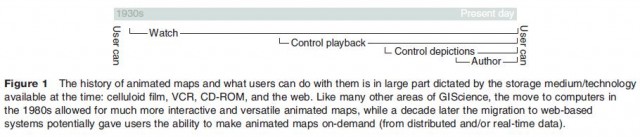
Research has shown that map animation can be used to generate new insights into geographic processes that had been previously unrecognized using either static maps or statistical analysis. The need for animated maps is further underscored by the recent and unparalleled explosion of digital geospatial data – much of it timeseries data. Fortunately, the simultaneous and rapid development of the World Wide Web and affordable, high performance desktop PCs have made animated maps far easier to make, distribute, and view. As a result, animated maps have gone from being painstakingly crafted novelties to commonplace digital documents. Making animated maps interactive further extends their utility and allows the reader to 'go into the map' and (in theory) change the map to suit their needs. The amount of interactivity, or control, the reader has over the animated map has steadily increased over time as technology permits (Figure 1), and ranges from none (e.g., weather map on TV) to near total (e.g., geovisualization system for epidemiologists).
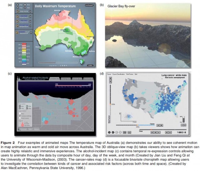
Almost any kind of map can be animated: weather maps of air temperature, choropleth maps of population density, graduate symbols maps of income, and so on (Figure 2). Major research topics within map animation over the last 15 years include: (1) methods for animating time series data, (2) methods for animating across attributes of data, (3) methods for representing uncertainty and data quality in animated maps, (4) designing effective temporal legends and controls, (5) identifying the visual variables of animation, and (6) methods for temporal interpolation and smoothing of sparse datasets.