Where Would You Expect Severe Weather?
YOU ARE A METEOROLOGIST at the National Weather Service and are responsible for providing an overview of weather conditions across the U.S. To do this, you will study maps showing weather conditions at the surface and aloft and then determine where and how different air masses are interacting. In addition, you will identify areas where some type of severe weather is possible and identify what type of severe weather is likely.
Goal of This Exercise:
Apply principles from this chapter to evaluate the weather conditions and make a forecast for where severe weather is most likely to occur.
Initial Procedures
Follow the steps below, entering your answers for each step in the appropriate place on the worksheet or online.
- Observe and characterize the main weather features, including cloud cover, fronts, type of air masses, air pressure, moisture, Rossby wave ridges and troughs, and the polar front jet stream.
- Consider all the surface and upper-level data to assess the likelihood of severe weather, identifying areas where different types of severe weather were likely to occur on two successive days.
These two pages display different types of maps, each showing certain weather features. Not all maps cover precisely the same area.
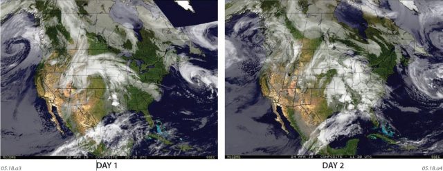
Surface Conditions
These satellite images show the conditions for two successive days (Day 1 on the left, Day 2 on the right). Observe these images and propose what weather features (such as storms and fronts) each shows. Then, compare the two images to determine how each feature is moving. Complete this phase before continuing on to examine other maps.
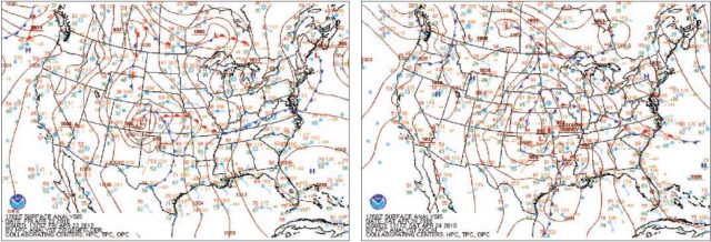
These maps show weather conditions for the same two days. Air pressure is represented with isobars (contours) and as highs and lows. The colored lines with triangles and semicircles indicate the location of fronts. Green areas are experiencing precipitation. Sketch a simple cross section across each main weather front.
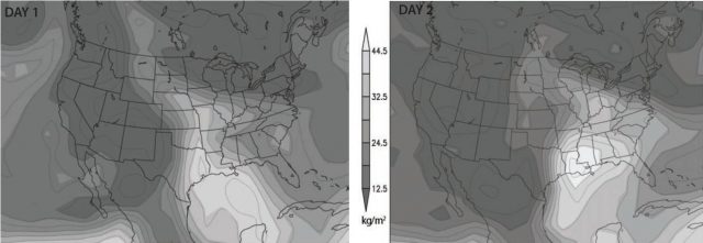
Atmospheric Moisture
These maps represent the amount of water in a column of atmosphere (in kg/m3) that would fall as precipitation if all of the water vapor condensed. Lighter areas have abundant water and darker ones have less water available to precipitation.
Dew point temperatures are represented by colors, with purple and blue showing the lowest dew points, and white and grays showing the highest ones. Yellows and orange indicate intermediate dew-point temperatures. From these maps, which air masses are wet, and which ones are dry? What types of air masses are likely present in each region?
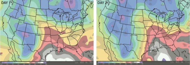
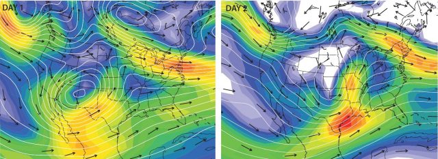
Conditions Aloft
These maps represent upper-level conditions with 300-mb isohypses (white lines). Colors show wind speeds based on the spacing of the isohypses. Can you tell which colors represent fast wind speeds? Red arrows show the general directions of airflow. Where is the polar-front jet stream? Which areas have upper-level support for storm development based on likely positions of upper-level divergence?
Final Procedure
3. Using the various data presented here, divide the map area into different regions, each characterized by a particular air mass. Describe the types of boundaries between these air masses, and sketch a cross section across each type of major boundary shown. Draw boxes where a severe-weather watch should have been posted for Day 1 and for Day 2. Your instructor may have you answer questions on a worksheet or online.