How Do We Use Maps and Photographs?
MAPS ARE AMONG OUR MOST IMPORTANT TOOLS for depicting and analyzing spatial information, whether we are interested in environmental issues or election results. Cartographers generate different kinds of maps that are designed to show Earth's landscape features, its weather and climate, and the distribution of plants, animals, or many other types of variables. Some cover small areas of Earth's surface, whereas others cover entire continents.
How Much Area Do Maps Portray?
If we are hiking across the landscape, we want a detailed map that shows the location of every hill and valley. If we are interested in global climate change, we may want a map showing average temperatures for the entire planet. We use the general term scale to describe how much area the map shows. More specifically, scale is the ratio of the distance on a map to the actual distance (in the same units) on Earth.
Large-Scale Maps
This topographic map shows hills and lakes that formed as glacial features in Kettle Moraine State Forest in central Wisconsin. We can convey the scale of the map in three ways. First, we can report the scale with words — on the original version of this map (reduced here to fit on the page), one cm on the map equals 24,000 cm on the surface. Second, we can report this same information as a ratio of a distance on the map to the actual distance on the ground, which is called the map's representative fraction; for the original version of this map the representative fraction was 1:24,000, as reported on the map. Third, most maps include some type of visual bar scale.
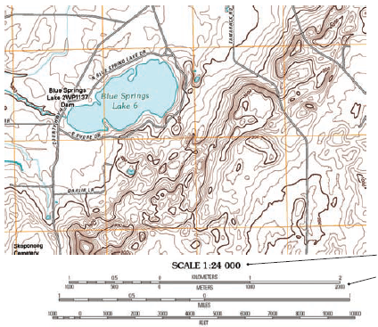
The original scale of this map, 1:24,000, is the typical scale used in the U.S. for topographic maps, with one inch equaling 2,000 feet. A map like this, which shows a local area, has a large representative fraction. It would require a relatively large map to show a large area — it is called a large-scale map.
Small-Scale Maps
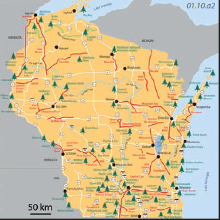
The map above shows state forests in Wisconsin. With this type of regional map, we can portray a relatively large area with a relatively small map — such a map has a small representative fraction and is a small-scale map.
How Are Maps Made?
Originally, topographic maps were produced by sending a team of surveyors out in the field and having them map the area, drawing lines on paper maps, and taking notes. Today, such maps can be produced directly from laser and radar measurements from orbiting spacecraft or from pairs of photographs taken from slightly different perspectives.
1. Aerial photographs are typically taken from a plane or satellite as it flies across the terrain. The onboard, downward-pointing camera takes photographs at specific intervals in such a way that there is some overlap between the area captured by two successive photographs. The perspective of the camera is slightly different between the two photographs in the same way that our two eyes simultaneously have a slightly different perspective of the same scene. Test this concept by looking around, closing one eye at a time, and noticing how objects shift slightly in position relative to one another. The apparent shift is related to their difference in distance from us.
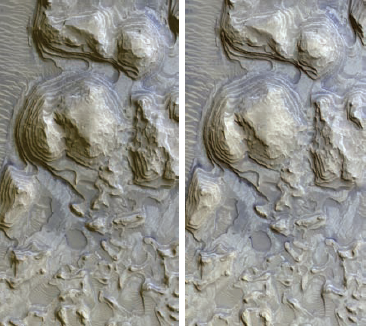
2. Two aerial photographs that have overlapping coverage and slightly different perspectives are called a stereo pair, usually generated by two images taken seconds apart, while the plane or satellite is moving. In other cases, both images are taken at the same time but by two different cameras placed a specific distance apart. When the two photographs of a stereo pair are placed at a proper distance side by side, a tool called a stereoscope enables us to see the scene in 3D, with the hills appearing to stand in relief above valleys. Such stereo pairs can be used in the construction of a topographic map, and many of the earliest topographic maps were originally constructed using stereo pairs.
How Can Maps Be Used for Reporting Information?
Sometimes we make new maps in the field, such as by using surveying equipment to construct a topographic map that depicts the shape of topography. In most cases, we use existing maps, like the ones shown previously, and mark on the map the location of things we observe, such as the locations of glacial features or certain types of trees. In either case, this type of map actually produces new knowledge and is therefore a form of primary data.
The procedure is to visit the field site with an appropriately detailed map or aerial image, upon which observations can be plotted. Such maps and images upon which data are plotted are called base maps. The base map can be a large-scale topographic map or a detailed aerial photograph, like the one shown to the right. Observations and other information are plotted directly on the base map or on a partially transparent overlay. Alternatively, locations can be determined with a hand-held GPS device where the coordinates are saved and later mapped by various mapping programs.
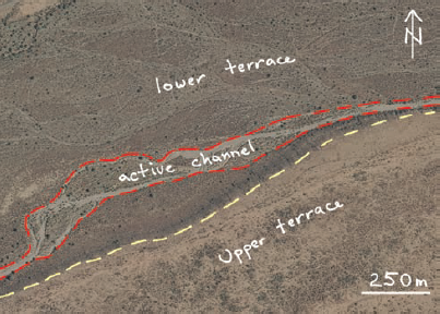
This aerial photograph shows different materials on the surface of several levels (elevations) along a desert river channel. The gray part, bounded by the dashed red lines, represents the active channel and related areas that are flooded during most years. The lower terrace is slightly higher in elevation above the channel, and is flooded less frequently. The upper terrace is high enough to avoid any flooding. This map was produced by walking through the field area and drawing on the aerial photograph the boundaries between different areas. This map would be useful for determining flooding potential and other types of land-use planning.
How Can Maps Be Used to Analyze and Interpret the Environment?
Preexisting maps become the basis for various interpretations. For example, the annotated aerial photograph above could be used to plan the locations of a subdivision, especially deciding where not to build. A preexisting map that is used for providing the input for answering some other question is known as a secondary data source.
Many maps contain a combination of data and interpretations. Examine this map of the Arctic National Wildlife Refuge (ANWR), an area discussed at the start of this chapter, and identify aspects that are data versus those aspects that represent some type of interpretation. Then continue reading below.
Data – The locations of features on this map would be considered data. These include the outline of the coastline, the boundary between Alaska and Canada, the locations of rivers and roads, and the outline of ANWR.
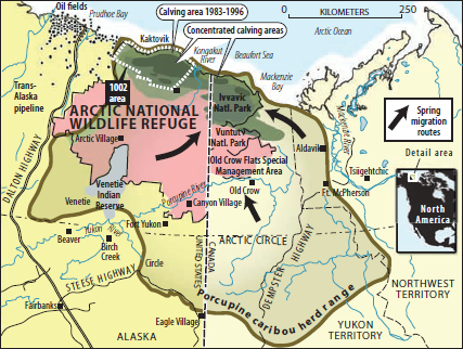
Interpretations – Other aspects of the map are interpretations, which commonly represent an expert's opinion of a situation. On this map of ANWR, interpretations include the migration routes of caribou (the large black arrows) and the locations where caribou give birth to their calves (calving areas, in green). To produce these interpretations, wildlife experts observed the habits of caribou and then generalized these to the interpretations shown. This map, consisting of data and interpretations, would be considered a secondary data source. It might be used to determine which areas are permissible for drilling.
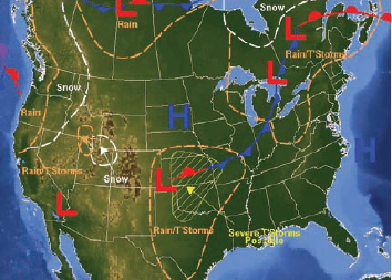
Surface weather maps likewise are a combination of data and interpretations. The edge of the continent and the outlines of states are clearly data. Weather maps also show analysis of the location of areas of relatively high atmospheric pressure (H), low atmospheric pressure (L), and weather fronts — lines interpreted to mark the boundary between air of very different temperatures and humidity. The triangles and semicircles point in the direction of air movement, another interpretation. Such maps help us predict today's likelihood of having precipitation and high winds.
